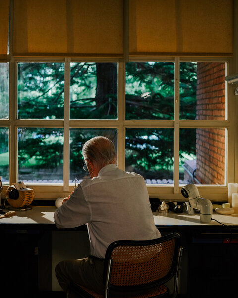
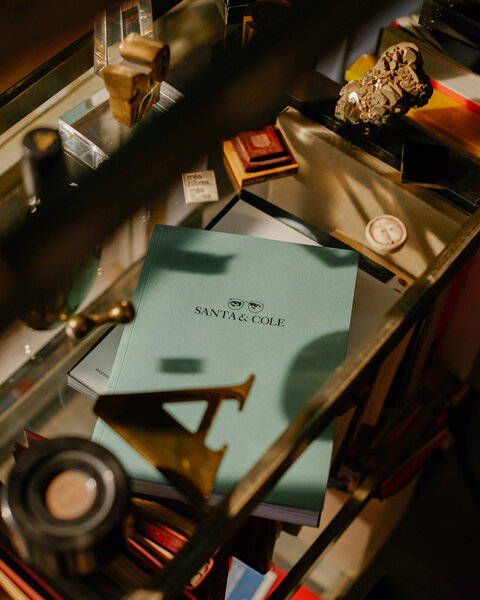
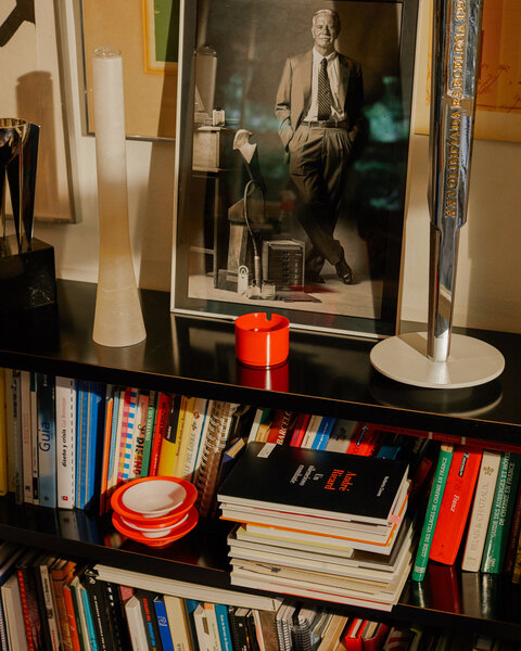
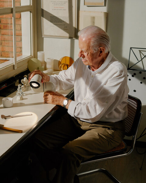
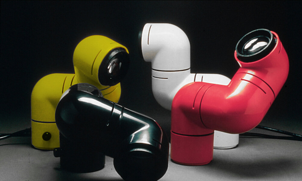
We sat down to chat with André Ricard, who has just turned 90, to explore his professional career through some of his designs, including Tatu, the 1970s pop icon re-edited by Santa & Cole. Furthermore, to commemorate the 90th birthday of this industrial design pioneer, Santa & Cole is launching the Petit Tatu wall lamp, Tatu’s smaller, wall-mounted version.
We discover how he tackles the various designs, what his concerns are and how he sees the discipline today.
You were born the year Mies van der Rohe and Lily Reich designed the German pavilion for the Barcelona International Exhibition. Do you think this pavilion has shaped the history of design in Barcelona?
The pavilion was unquestionably a milestone in the history of modern architecture, however, what was truly an emblematic piece for design was the Barcelona chair that defined the concepts of this movement. This chair (created for the pavilion and subsequently edited by Knoll) has undoubtedly influenced an entire era and is one of those designs that opened up entirely new creative horizons. It is one of the many works of the Bauhaus movement that heralded new concepts that still live on today.
Furniture is not among the kinds of design you have worked on most over the course of your career. However, one of your very first designs (in 1952) was a chair. How come?
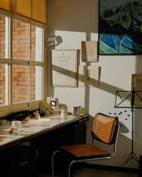
There was a long-standing tradition of wooden and straw chairs in Spain, but no contemporary piece that used these materials, or at least not as far as I knew. That’s why I designed that armchair that was even produced in a small series for my family and close friends. If I distanced myself from furniture it was because, at that time, there were plenty of people designing furniture, but no one was rethinking the many other objects and utensils we use every day. There was no one designing dishes, cutlery, glasses, containers or appliances. Creativelyspeaking, this was barren land.
Can you think of a piece of furniture that needs to be improved or perhaps one that has not yet been designed?
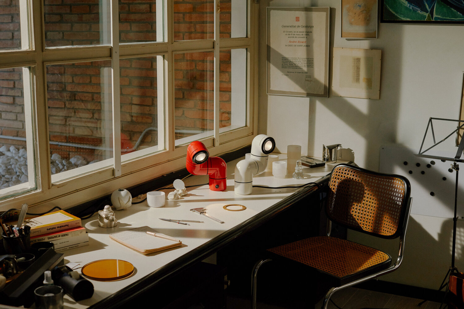
Yes. I would even venture to make a universal statement: “everything that exists can be improved” and I would add that, in the limbo of ideas, there are many designs that are still waiting to be revealed. But beware! Sometimes an improvement is only in a small detail, but you have to be humble enough to be content to make only that small contribution, which is a plus with respect to what existed before. For example, this chair in which we are sitting, the Cesca, is an excellent design, but its metal structure is uncomfortable and noisy when you move it. It would be advisable to avoid those annoying squeaks.
Speaking of improvements, which of humanity’s achievements stands out for you?
That’s a pretty transcendental question! I would have to think carefully about that. But, off the top of my head, I would say that I am very concerned about the technological advances that are overwhelming us. I wish that, in today’s society, with its escalating environmental problems deign creativity were always at the service of good sense, common sense and helping to improve people’s well-being and quality of life. This is precisely the specific role that, as I understand it, corresponds to design.
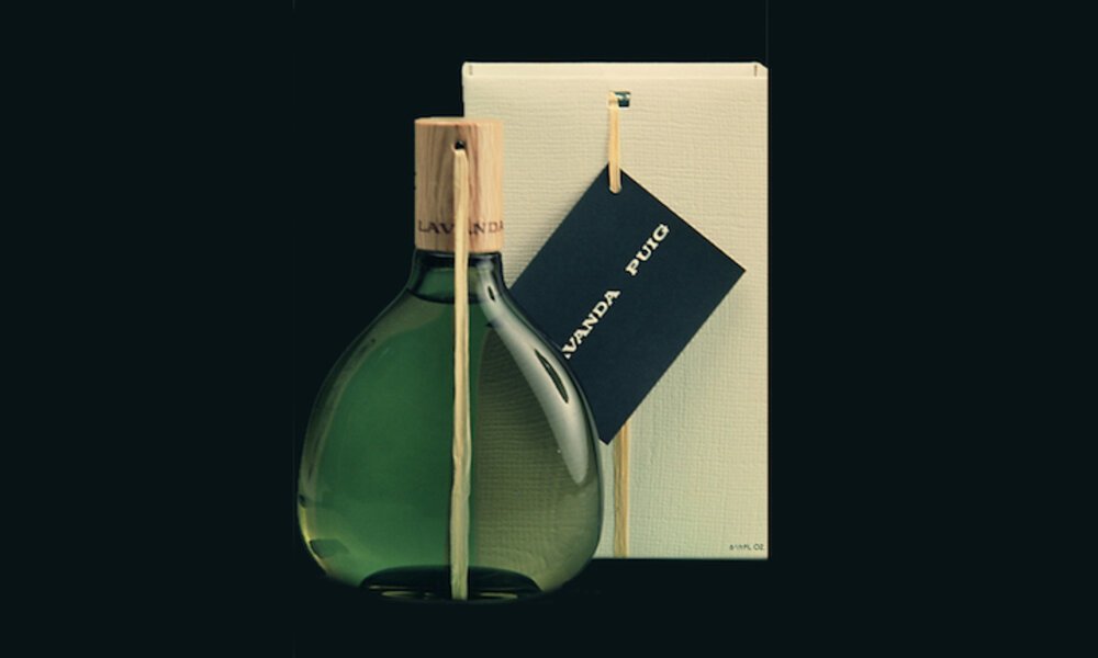
The bottle of Agua Lavanda Puig fragrance, known as Barcelona and made in 1963, was your first design for this company with which you worked for over forty years. How did that first commission come about and what does it mean to design a bottle of cologne, where perhaps the emotional component outweighs the functional component?
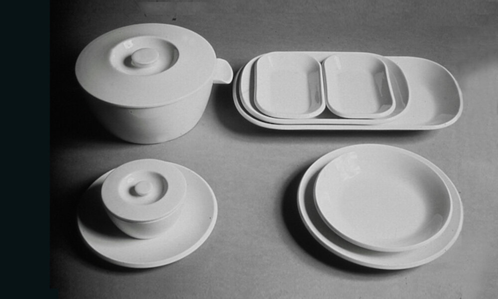
Antonio Puig Jr., an executive at the company, saw a stand that I designed for Porcelanas del Bidasoa at the Barcelona Fair. The whole stand was imbued with a different, more contemporary spirit. He asked them who had done all that. They gave him my name. They had a very special problem: they were dying of success! In fact, Puig had a line of lavender water with wicker-coated glass jars. The product was becoming increasingly popular in the United States, but demand was such that the production of the bottles—which were handmade— simply could not keep up. They had to find a solution without foregoing that unique character. My role was to “industrialise it” but at the same time to retain something of that handcrafted essence. Basically, it was squaring the circle! The new container had a few aspects that helped it keep that air of craftsmanship: the wooden plug, the smoked colour of the glass, a raffia and the sealing wax that sealed it. It was an industrialised bottle, but it maintained handcrafted elements that showed the intervention of a human hand in its making.
As Yves Zimmermann said, in a conversation included in Norberto Chaves’ book Un silencioso combate (A silent Combat), that bottle really is the synthesis of the synthesis of craft.
Yes and I think it is a very nice way of putting it because the bottle really is a summary of craftsmanship through those small details – threading the raffia and sealing with the wax were two actions that could only be done by hand; they could not possibly be done otherwise. A little expressed a lot.
After many years of silence and dare I say even of discredit, craftsmanship has recently regained prominence. Why do you think this is?
Globalisation ends up making cultures uniform. Today, in developed countries, the cultural differences that should distinguish them are nowhere to be seen. Everything looks alike: from the airport, to the taxi, the hotel, the streets, the clothes, music, fast food restaurants, consumer goods, movies. But, at the same time, there is still an underlying desire to differentiate, to identify, to maintain traditions, things that only crafts can fulfil. Hence its growing prominence.
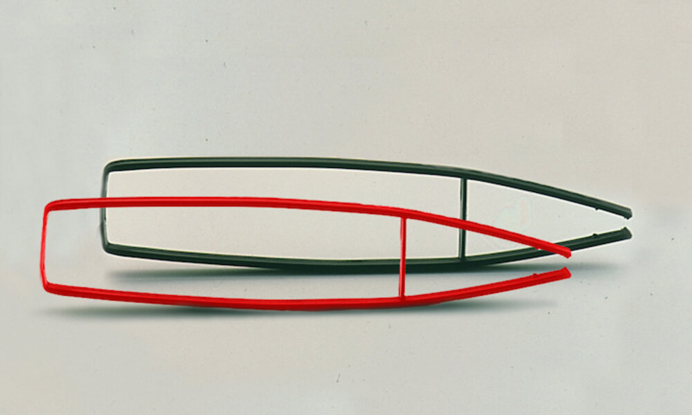
The ice tongs, designed in 1964 and still being produced, are one of the products that best reflects the way you see design. How did the idea come about?
In a creative process there is always a magical moment. You don’t know that you have ideas in you that, suddenly, come to your imagination. That’s what happened with the tongs. I wanted to avoid having to have that constant pressure that existing tongs needed to keep the ice cube in place. Might there be a way to go backwards, so that the pressure was only needed to grab the cube and then it could be held in place by the tongs’ own pressure? The simplicity of the system shows that, sometimes, improving a design consists only of turning the concept around, like turning a sock inside out.
That year, the tongs received the ADI-FAD Gold Delta award. It signalled the recognition of a jury composed of national and international colleagues like Max Bill, Sigvard Bernadotte and Javier Carvajal. How important was that at the time? Why? Do the awards have the same meaning now?
In Spain, the design movement had begun to develop a few years before, but nobody talked about it; nobody talked about ADI-FAD. This was normal because nothing was happening that caught people’s attention or made the headlines. We met, we debated, but we didn’t create news. I had been on the jury for an award in Belgium and when I returned to Spain I thought, why don’t we give a prize? It was relatively easy and inexpensive to organise. That’s how we created the Delta Awards. For a few days, the awards helped us attract the attention of important people. You cited Max Bill, who had been one of the promoters of the Ulm or Sigvard Bernadotte School, representative of the best Scandinavian design, and like he did, everyone we invited came. The jury did not confine itself to granting the awards, it also explained to us why those particular products had been chosen, in the process giving us a lesson on how to understand design. From then on, we were featured in the press, we were news, we made ourselves known.
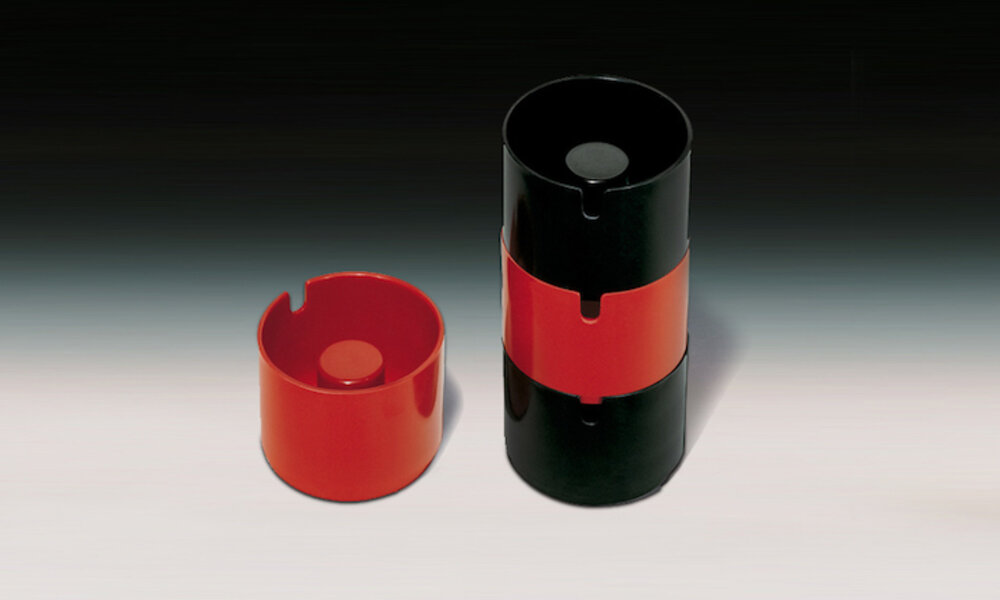
Copenhagen (1965) is the paradigm of a series of ashtrays designed over a five-year period. At that time, this type of product was very much in fashion and it seemed that, apart from colour and material, little could be done to improve it. How did the idea come about and what did it contribute compared to other ashtrays?
Looking back, I wonder why nothing like it had ever been designed before. I was a smoker then and all the ashtrays were as flat as plates. Any small displacement or gust of air and the ash was scattered everywhere. It seemed incomprehensible that ashtrays were not deep, but none of them were. So that was the starting condition of the design. But then the question was where to put the cigarette out. We had to make a cylinder emerge in the centre, an area where people could extinguish their cigarettes. This central cylinder also had the advantage of acting as a kind of buffer to hide all the ash and cigarette butts at the bottom. Why not give this ashtray the dimensions of a glass? That is, make it something you could carry easily so you did not have to stay near a table to flick your ash. And all you had to do was to stack them to prevent a cigarette butt from smoking. With one little thing many small problems were resolved.
In 1972 you designed the Tatu lamp (1972) that emerged from a very specific need. Can you explain it to us?
The idea for the Tatu lamp came about because I like reading in bed at night and this was an inconvenience because my wife does not. So there was a problem to solve. Noticing how on airplanes I could read at night thanks to a spotlight that illuminated only my book, while the rest remained dimmed, I said to myself: “Why can’t the same solution apply at home?” There was no question of fixing a spotlight on the ceiling, so I looked for a separate system to direct a beam of light. That was the starting point for the Tatu lamp. It had to be a pliant, convenient piece that could shine a powerful beam of light wherever needed. Three elbow-shaped pieces allowed total mobility and enabled the lamp to fold perfectly into itself, like an armadillo (tatu, in Spanish) does to protect itself. Hence the name of this design.
Tatu has been re-edited by Santa & Cole almost 50 years after its design. How did the project come about? What changes and improvements have been introduced?
Quite rightly, Santa & Cole was interested in this design because it offers a very special, unique type of lighting. In this new version we have managed to incorporate the improvements allowed by today’s new technologies. I am referring to an increased intensity of the light beam, without overheating, and the possibility of expanding or concentrating the illuminated area. All this enhances the performance of this revisited version. So Tatu is reliving its youth, and a descendant has also been born: Petit Tatu, which opens up new and interesting applications.
Most of your designs are discreet and I would say even anonymous to most of their users. Do you consider that these features, together with longevity in the market, are the basis of a good design?
There have been many objects throughout the history of mankind that have not reached us because they did not properly fulfil their purpose. Those who decide if a particular thing, and the novelty it brings, should continue to exist are not the designers, but the people who use it. There is a cultural selection in the same way that there is a natural selection. We talked about the Copenhagen ashtray that is still in the market today, not because of the way it looks but because it does what it is supposed to do well. Also, functional perfection is beautiful, and you find it in the shoehorn, in the button, in the hexagonally faceted pencil. What keeps things relevant is their usefulness.
But… that is also influenced by good design…
Well, that’s what good design is (laughs). A good design means that an object works well and, as I say, when something works perfectly it is generally beautiful. I think that simplicity is the maximum that is perceived, as Yves Zimmermann put it “the synthesis of synthesis.” For example, a lamp like Miguel Milá‘s TMC, or perhaps even more the TMM, cannot be simplified any further.
Less is more?
True. Why make it complicated when you can make it simple? I think one of the qualities of a good design is that its configuration should be as pure as possible. The formal complexity of an object often conceals creative paucity.
Is simplification synonymous with sustainability? What role does the designer play in connection with this issue that is of such concern today? Is it only a matter of materials or do other matters come into play?
The progress achieved in the field of sustainability hinges above all on macro-level political and economic decisions to which design has no access. However, at its more modest level, design can also contribute to this important cause, its role being to take potential environmental impacts into account from the initial project stages. This applies to all phases of the product’s life cycle, seeing how these impacts can be avoided or at least mitigated. From production, through use, to a product’s final degradation. Factoring in issues such as the materials used (renewable or biodegradable), their repairability (ease of disassembly) or their eventual recycling. In each of these phases, design can contribute positively to this common cause.
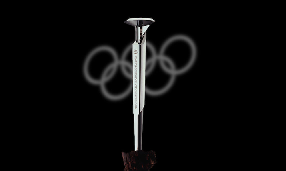
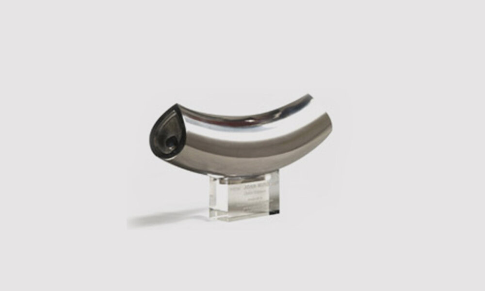
Your best-known design is undoubtedly the torch for the 1992 Olympic Games in Barcelona. How does a designer tackle this kind of object, so representative and, above all, so high-profile? What is the value of design in them?
Here we are not talking about prose, but about poetry. In other words, here the symbolism is more important than the functionality. I approached the design of the torch by trying to steep myself in the spirit of those who see the Olympic Movement as a kind of religion. Consequently, I had to treat the project as though I were designing a liturgical object, not a functional object. For me, the torch conveyed the Olympic spirit in the same way a monstrance conveys the Blessed Sacraments. That was my initial approach. Then I had to materialise that symbolism with a view to the 20th century, nearing the cusp of the 21st, and in a city like Barcelona which was experiencing a design boom.
The improvement of everyday objects has always been a concern and a point of interest for you. Do you think these are still the products most in need of a designer’s intervention?
As I said before, in all products in which the form is what produces the function or a good part of it, design is essential. We have a very intimate, physical, sensual relationship with most objects and appliances that we use in everyday life. We handle them, we manipulate them, we use them a lot. Whether it’s tableware, glasses, cutlery, containers, all of them are things we use constantly and, unfortunately, they are not always well designed because traditional ways are still applied when sometimes our way of life has changed radically.
Have we solved the sugar package problem?
Yes. At last! I always say that the best way to ascertain the quality of design in a country is to go to a supermarket and see how the simplest products are packaged: sugar, rice, pulses. Although we have made a lot of progress, some packaging still needs resolving, for example, blister packs. As well as being incredibly frustrating to open, it is easy to hurt yourself in the process.
In which designer would you like to be reincarnated?
Charles Eames, whom I admire for the way he has focused his creativity.
And if you were an object, what object would you like to be? Why?
Some very elementary utensil. A bowl, a spoon or a knife, they are the most essential.
How do you think design should be approached right now?
That’s a tough one. The world has changed a lot in recent decades. I have asked myself this question many times. If I were commissioned now to design an object for mass use, if I were given the time and means, I would like to design things that were timeless, not subject to the passing trends of the moment. Right now, fashion prevails in almost all areas and makes objects at the peak of usefulness seem outdated. The greatest satisfaction for a designer is to see that his work crosses the fashion barrier and this renewed version of Tatu has this virtue: to cross the barrier of time and remain a useful, basic, insuperable object. All this is also linked to all the environmental problems. Unfortunately, I’m afraid designers are too insignificant on the grand scale of things to solve all this. We can try to improve design, but I am quite pessimistic.
Would you be a designer again?
Yes. Yes, of course. I would be content even with a very humble attitude of improving the small details of small things, as I said at the beginning.
To whom would you give the next National Design Award? Why?
To Victor Papanek, whom I met years ago and who promoted ecologically and socially responsible design.
